Trend metrics & compare time periods
How to visualize trends and compare discrete time periods within your historical Synthetic and RUM data.
The Internet really is a complicated series of tubes. As a result, any time-based metrics we capture can have variations as those tubes wobble a bit as we shove data down them. To help reduce that variation, when we do synthetic tests, we always load a page at least three times and take the median result. But even then you'll find that, over time, your charts will still show plenty of variation.
All that variation can make it difficult to see if your metrics are getting better or worse over time. Here's how to visualize trends and compare discrete time periods within your historical Synthetic and RUM data.
Highlight trends in your metrics
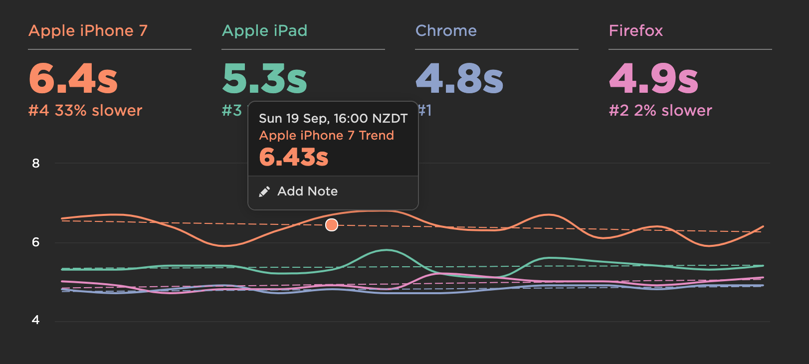
To make it easier for you to see which direction your metrics are heading, click the three dots icon in the top-right corner of any dashboard, and then click the Show Trends toggle:
You can hover over the legend to highlight a trend line or hover over any point on the trend to see the estimated value at that point.

Compare time periods
There's really only one question that always needs answering when discussing web performance: Are we getting faster or slower?
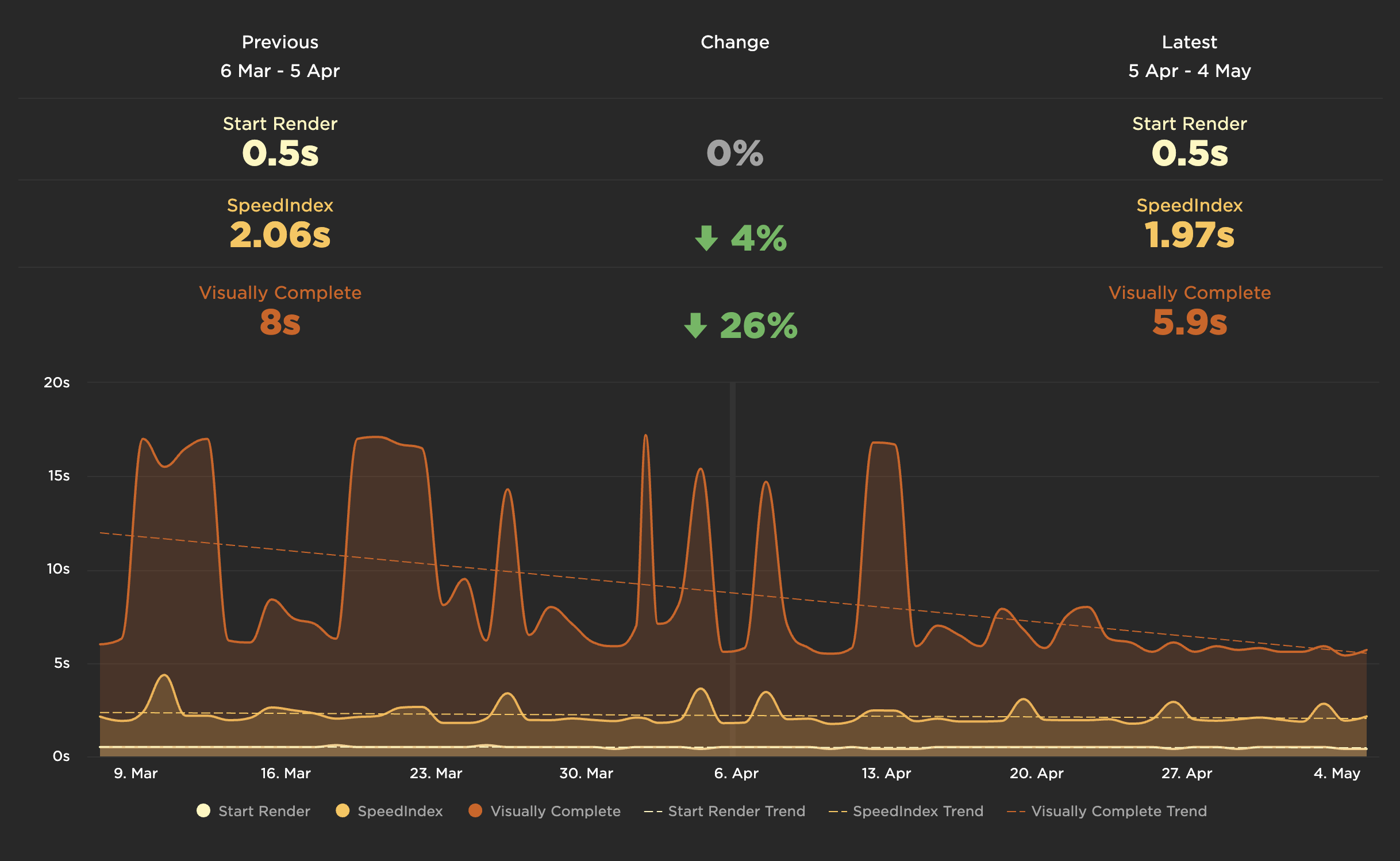
Compare mode helps answer that question and shows just how much things have improved or regressed over the most recent time period compared to the previous one.
To turn on compare mode, go to your dashboards and select the length of time you want to compare (7 days, 1 month, etc.). You can also select a custom start/end date. Then turn on Compare Previous Period.

You can easily see (and show your boss) where you got faster (hopefully):

Things to compare:
- Pick a day of real user traffic before and after the release of a new version of your site.
- Track your month-to-month progress on a project, such as refactoring your Javascript.
- Keep a watchful eye on third-party metrics. Review and compare them each month to make sure you're not regressing.
Updated 11 months ago