Speed Index
What is the Speed Index score and why does it sometimes not align with your other metrics?
Speed Index can be a good synthetic metric for measuring user-perceived performance, but it doesn't work for every page. Here's how it's measured, and why it doesn't work on some pages.
How Speed Index is measured
In the history of performance metrics, Speed Index was a huge evolutionary leap from previously popular metrics like start render and load time. It represented the first time any tool attempted to tackle the issue of measuring what users actually see.
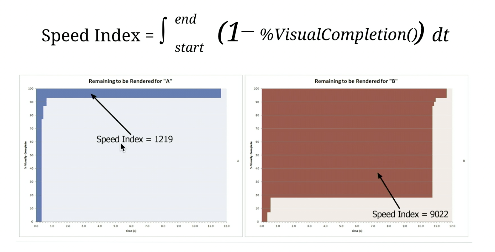
Speed Index is the average time at which visible parts of the page are displayed. It identifies when the visible parts of a page are displayed.
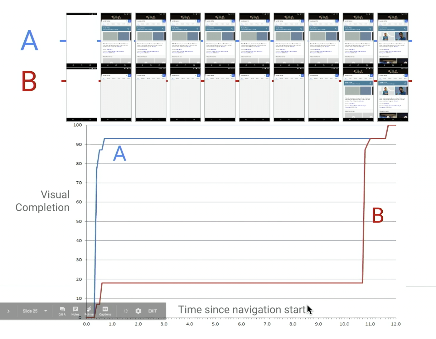
Speed Index is based on measuring when visual content (e.g., images and video) renders within the viewport. Speed Index evaluates the percentage of visual completion of a page at every point in time. It does this by looking at a filmstrip view of your page rendering, analyzing it on a frame-by-frame basis, and looking for changes in the colour palette.

Then it calculates visual completion as a percentage over time and calculates the total area above the percentage curve. This is expressed in milliseconds:

Within SpeedCurve, those milliseconds are converted to seconds (e.g., a Speed Index score of 1219 becomes 1.22 seconds) because it makes it easier to display alongside the other time-based metrics in your charts.
Speed Index doesn't work for all pages
For many pages Speed Index can be a good indicator of visual completeness, but because of how it's calculated, it doesn't work on all pages. It's not a specific point-in-time, but instead is an aggregate stat, so it's a bit apples-to-oranges when compared to time-based metrics.
Because Speed Index is dependent on how the page is built, it's not a one-size-fits-all metric. For example, a SpeedCurve customer was getting confusing Speed Index results for mobile. The reason why their Speed Index was fast – despite the fact that their viewport was almost empty – was because most of their "above the fold" content was not image-based.
Updated 11 months ago