Find and Fix Cumulative Layout Shift (CLS) Issues
How to quickly identify what's causing the biggest layout shifts on your pages
Cumulative Layout Shift (CLS) is one of Google's Core Web Vitals that has been a bit elusive in terms of diagnosing exactly what causes a poor score. You can use the visualizations in your Synthetic test results to help you see when and where layout shifts are happening on your pages.
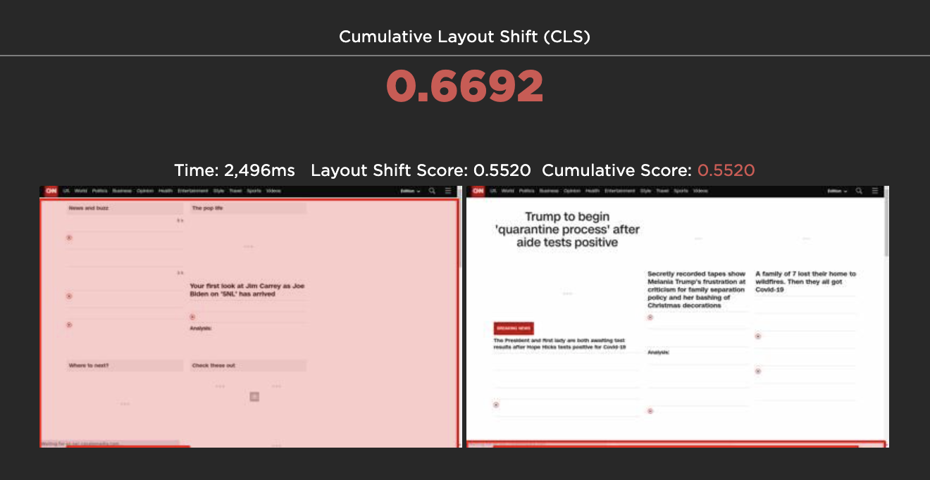
Comparing the screen before and after a layout shift
What is Cumulative Layout Shift?
CLS measures how visually stable a page is. It's a formula-based metric that, put very (very) simply, takes into account how much visual content shifts within the viewport, combined with the distance that those visual elements shifted. You can dig deeper into the mechanics of how it's calculated, but the human-friendly definition is that it helps you understand how likely a page is to deliver a janky, unpleasant experience to viewers.
According to Google, pages should maintain a CLS score of less than 0.1 at the 75th percentile for mobile and desktop devices. A score greater than 0.25 is considered poor.
How to track CLS in SpeedCurve
With SpeedCurve, you can monitor CLS in both Synthetic and RUM. There are a couple of ways you can do this:
Create a custom chart in your Favorites dashboard
This short video shows how to create a Web Vitals dashboard and set performance budgets and alerts.
By default in your RUM and Synthetic dashboards
You'll find Web Vitals in your RUM 'Performance' dashboard and in your Synthetic 'Sites' dashboard. (Note that Synthetic can't track First Input Delay, since that's a real user interaction metric, so instead we track JS Total Blocking Time, which is a good synthetic proxy.)
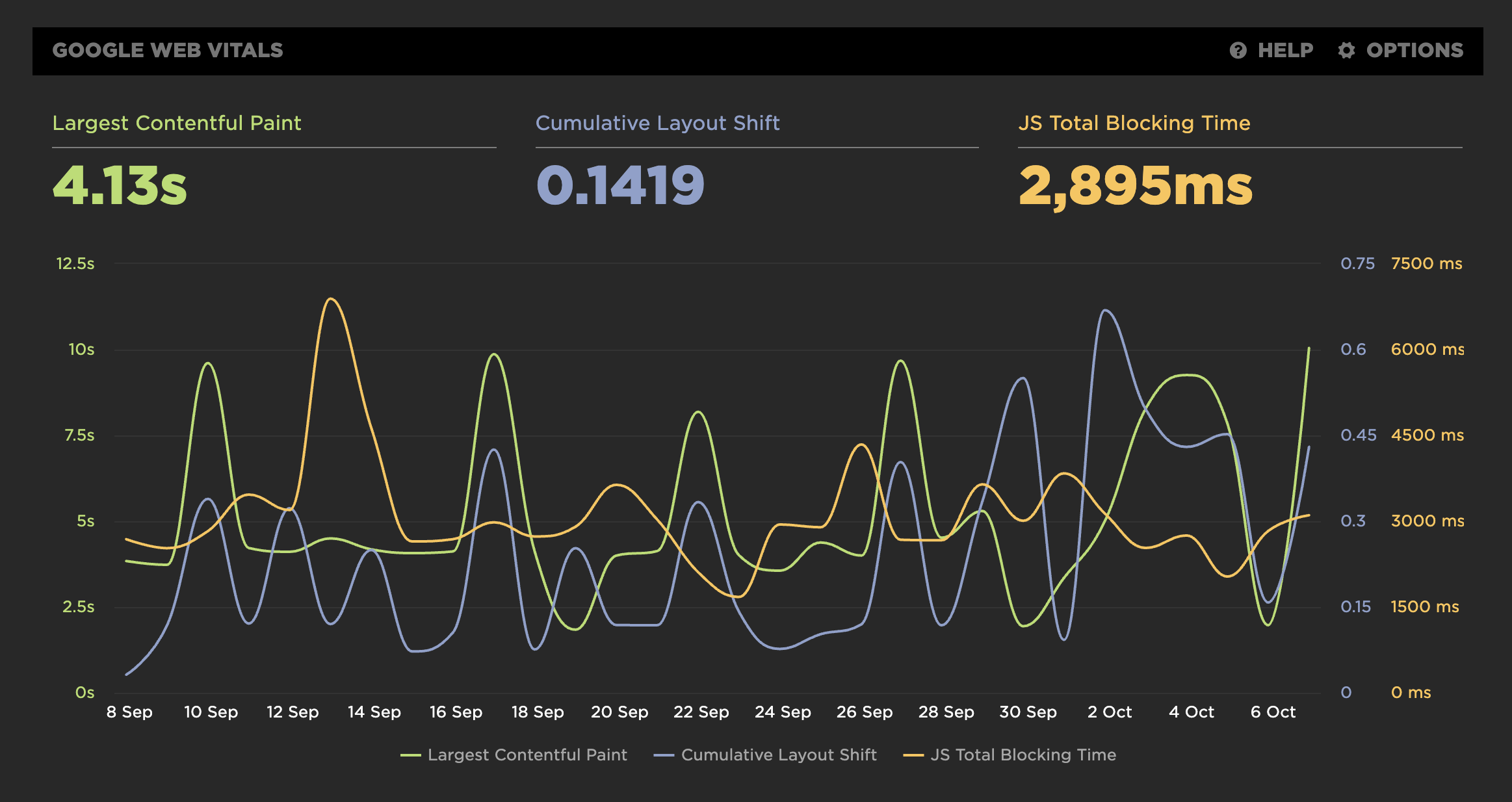
Core Web Vitals chart
Get detailed layout shift visualizations
From any of your Synthetic charts, you can drill down into your detailed test results. Your test details include CLS visualizations that help you see where exactly your biggest layout shifts are occurring.
To drill down, click on any point in a chart, and select "View Test":
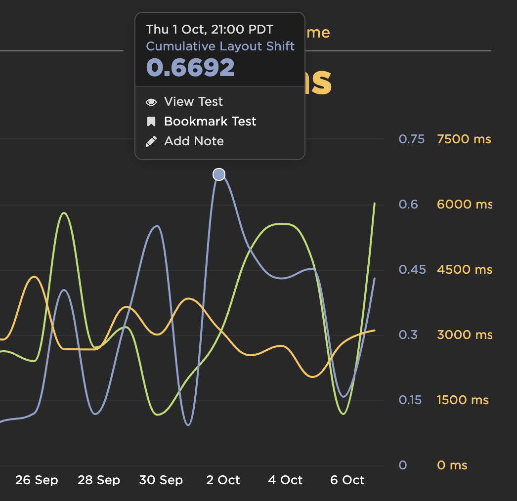
Selecting a test from the Core Web Vitals chart
Next, scroll down the test page to see when and where layout shifts are occurring and the impact they might be having on the user experience.
On your high-level waterfall chart, you can see when the largest layout shift occurs. This is a really helpful way to prioritize what you need to fix.
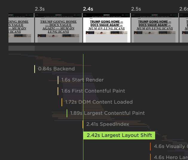
Identifying the frame with the Largest Layout Shift
Scrolling further down the test results page, you can see layout shift visualizations. These show you:
-
Total CLS score, highlighted in green if it's "good" according to Google's definition (less than 0.1), and in red if it's not (greater than 0.25).
-
Time when the shift happened during the page rendering.
-
Location and size of shifted element, highlighted in red frames.
-
Layout Shift Score for each unique shift.
-
Cumulative Score – also highlighted in green or red. For example, for the first few layout shifts, your Cumulative Score might be green. For later shifts, the score might be red. This helps you see when your score flips over to being "poor" by Google's definition.
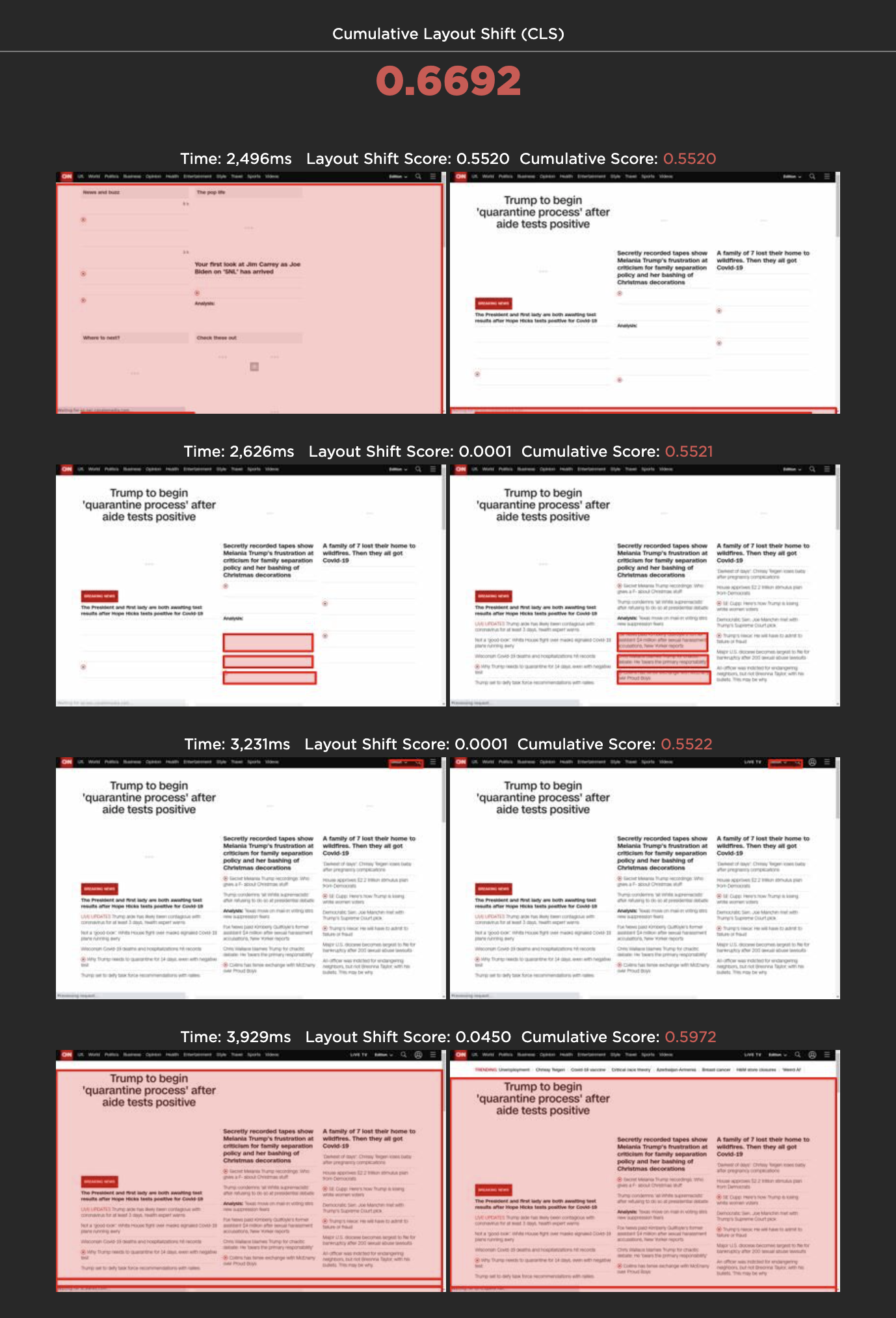
Visualizing the elements that moved
Video walkthrough
Here's Cliff with a short video explainer that walks through how to track CLS and find your layout shift visuals:
Updated 11 months ago