Exploring Dashboards
Navigating SpeedCurve's curated dashboards
Curated dashboards
SpeedCurve has a collection of purpose built dashboards available from the left navigation. We refer to these dashboards as being 'curated' as they are designed to address specific use cases related to performance. They are not able to be modified beyond filtering and changing your dashboard options. The following is a list of the curated dashboards available, with video walkthroughs if applicable.
Home
The Home dashboard provides a performance overview over the last 3 days. Filterable by Site, this dashboard is a good jumping off point for other areas in the product.
Changes
The Changes dashboard lists deployments made using the deploy API or other CI/CD integration. Additionally, if you have configured Performance budgets, any violations of the budget will be shown here.
Budgets
The Budgets dashboard displays all of the performance budgets that are defined for a site, and shows the current status (Green=good, Red=bad).
Vitals
The Vitals dashboard is unique in that is uses both RUM (if active) and Synthetic data. The collapsed view is an overview of your Core Web Vitals with the current status based on the thresholds for the 75 percentile of the metric as defined by Google. Expand each section to see details around the historical performance and the distribution of performance, as well as actionable recommendations to improve each vital.
Improve
The Improve dashboard aggregates your Lighthouse score across all the pages measured for a given Site. This is very useful for showing where you can have the most impact on the largest number of pages. Additionally, you'll see a 'RUM Impact' column. This tells you roughly how much of an impact the changes would have on traffic from real users. (This is dependent on page labels matching between RUM and Synthetic.
Deployments
Including SpeedCurve in your CI/CD workflow is a popular practice for SpeedCurve users. Whether you are testing manually through the UI or using our GitHub Integration orDeployments API, the Deployments dashboard gives you insight into your current and historical deployments and links you to the Deployment details 333for each snapshot you've created.
Bookmarks
This is a very useful place to keep quick links to test results (SYN) or session details (RUM). Learn more about using bookmarks and comparing tests and sessions.
RUM Curated dashboards
In the sub navigation of the RUM menu, you'll find the following dashboards that are specific to RUM data.
Live
A real-time view of your users and high-level metrics for your site.
Sessions
This dashboard focuses on a subset of real user sessions. It's accessed by clicking on any RUM time series data point, or by default from this menu for the last 24 hours of RUM session data.
Compare
You can compare any two sessions or any other segments using the RUM Compare dashboard. This is a very powerful view that allows you to see differences between data sets. Want to understand how an A/B testis performing? How about differences between convertedusers and those who left without purchasing? There are a lot of possibilities with the Compare dashboard.
Users
The RUM Users dashboard focuses on data related to the user experience. This includes things like sessions, pageviews, bounce rates and correlation charts for both bounces and conversion. This data is really useful in understanding what your user base looks like, and can be a great reference point for creating synthetic tests.
Performance
Not surprisingly, the Performance dashboard is focused on performance metrics. Specifically things like network time, front/back end performance as well as a performance heat map that helps you quickly identify hot-spots in your application.
Design
Understanding how design decisions and the construction of your pages impacts real world performance is especially important. This is more content centric than other dashboards which helps you identify form factor of your users as well as the elements they are interacting with the most.
JavaScript
Performance of JavaScript has a huge impact on the user experience. This dashboard begins by showing the correlation of JS longTasks on user behavior (bounce rate) and includes many metrics that help understand where opportunities may lie to improve/reduce excessive CPU utilization from JavaScript.
JavaScript Errors
By default, SpeedCurve RUM collects JavaScript errors. This dashboard helps to isolate where those errors may occur, show you examples of the most common errors and trend the rates over time.
Page Views
The page views dashboard is simply a list of page views over the last period. Details for each of the page views is provided, including everything that was captured from the page. This is extremely useful when debugging RUM Page Labels or Custom Data.
Synthetic Curated dashboards
In the sub navigation of the Synthetic menu, you'll find the following dashboards that are specific to Synthetic data.
Site
This is a great starting point for performance investigation. This dashboard focuses across your entire site, highlighting pages that may need attention as well as data that applies across all of your pages.
Page
The page dashboard isolates data specific to a page within your site. Data is trended over time in this view and recommendations are specific to the individual page.
Compare
Whether you are comparing two tests or specific tests from a deployment, the Synthetic Compare dashboard provides a breakdown of several metrics between two tests. For more on comparing synthetic data, see the Bookmark and compare section.
Responsive
How your site performance across different form factors is often overlooked. Design decisions related to responsive pages often don't take into account the performance impact related to screen size and viewport.
Assets
Pages are made up of assets. Understanding how performance of specific resources is impacting your overall user experience can be overwhelming at times. The Assets dashboard highlights the slowest and largest resources on your page as well as how efficiently they are being cached across your site.
First & Third Party
Sometimes performance can feel like 'death by 1000 cuts'. The impact caused by poorly performance third parties can be tremendous. Additionally, there are first party assets that often need to be looked at independently such as collections of JavaScript, groups of images or other special content that you need to keep an eye on. The First & Third party dashboard is a longtime favorite that really helps to illustrate just how much of an impact those requests groups have on the user experience.
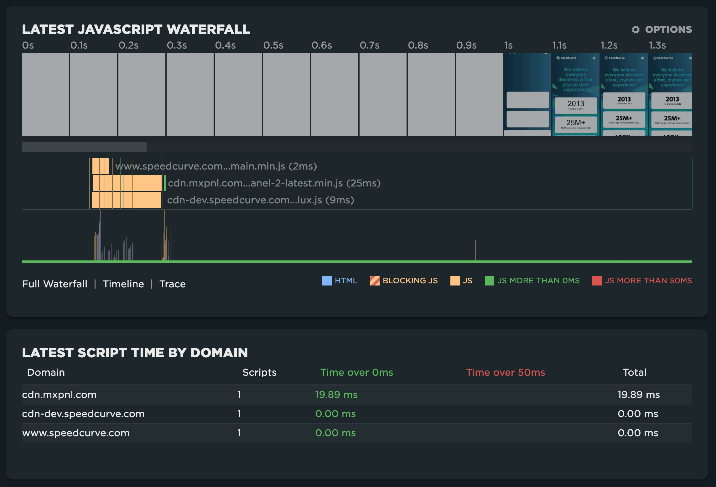
JavaScript
Unlike RUM, synthetic data can give us a great deal of insight into the attribution of poorly performing JavaScript. The Synthetic JavaScript dashboard provides a JavaScript only view of the waterfall and lists the script time by domain for a given page. For more on troubleshooting JavaScript, see Monitor JavaScript performance.
Benchmarks
Competitive benchmarking is a great way to get context around your site performance. By comparing metrics as well as page construction across your top competitors, you'll quickly understand where they may be doing better (or worse) than your own site.
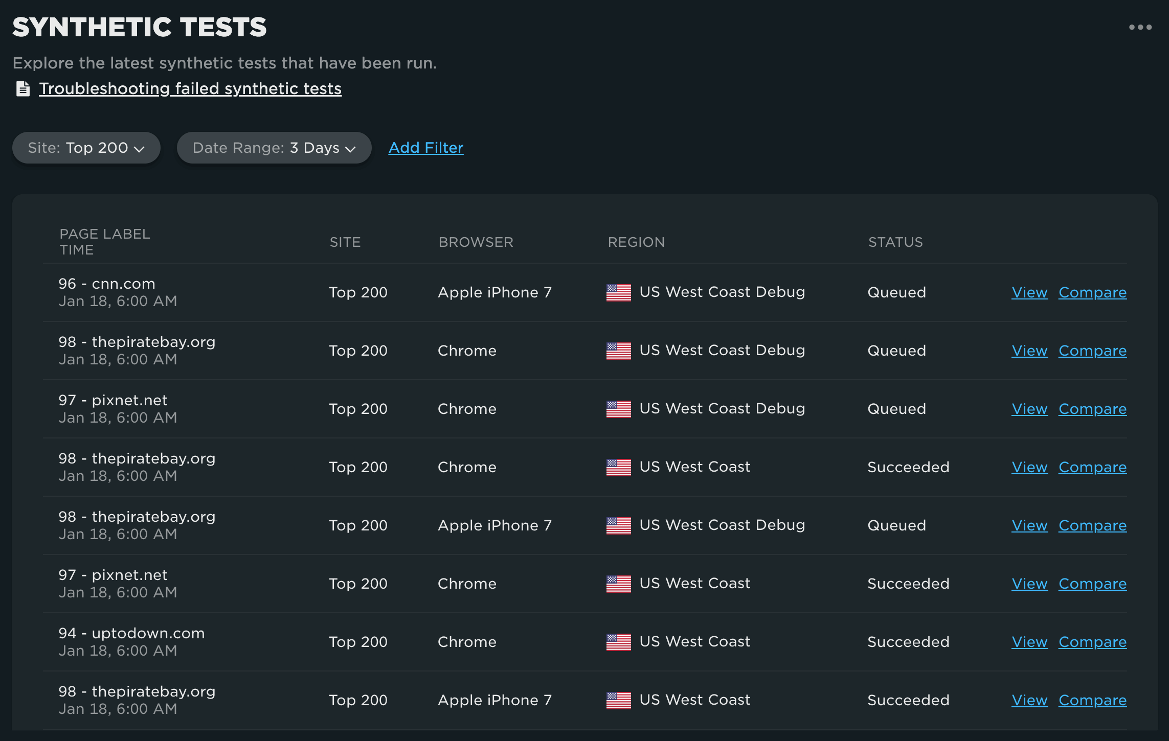
Tests
Finally, the Tests dashboard is a filterable history of synthetic tests and their status. View test details or compare test results directly from this dashboard.