Create correlation charts
How to create charts that correlate your performance metrics with user engagement and business metrics.

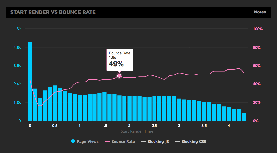
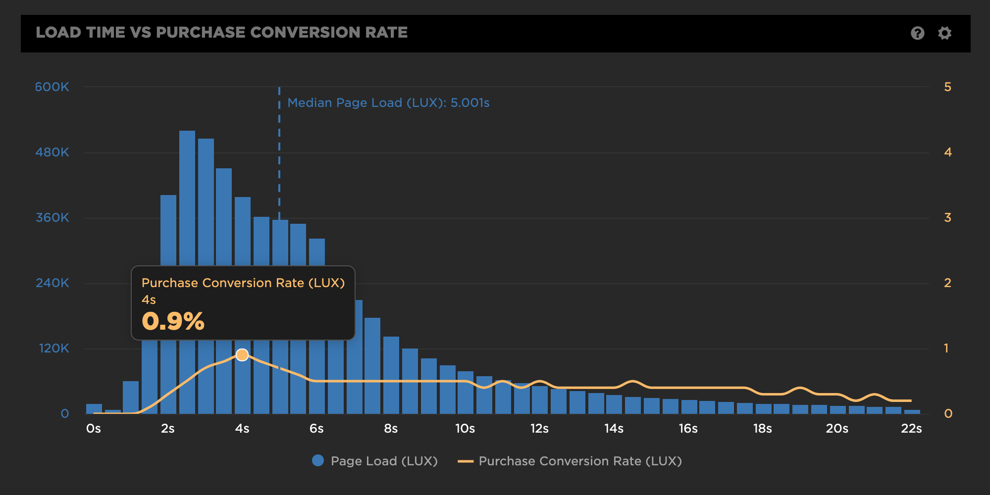
Correlation charts give you a histogram view of all your user traffic, broken out into cohorts based on performance metrics such as Start Render and Load Time. The chart also includes an overlay that shows you a user engagement metric or business metric – such the bounce rate or conversion rate – that correlates to each of these cohorts. This lets you see at a glance the relationship between performance, user engagement, and your business.
To create correlation charts, you need to gather data via real user monitoring (RUM).If you're not using SpeedCurve RUM, contact us at [email protected] to add RUM to your plan or start a free trial.
Correlation charts can help you in a number of ways, including:
- Communicate about performance to a business audience. These visualizations let even the most non-technical stakeholder easily see the correlation between performance and your business.
- Spot performance-blocking trends. You can create charts that let you see the correlation between blocking JavaScript and CSS with your other metrics.
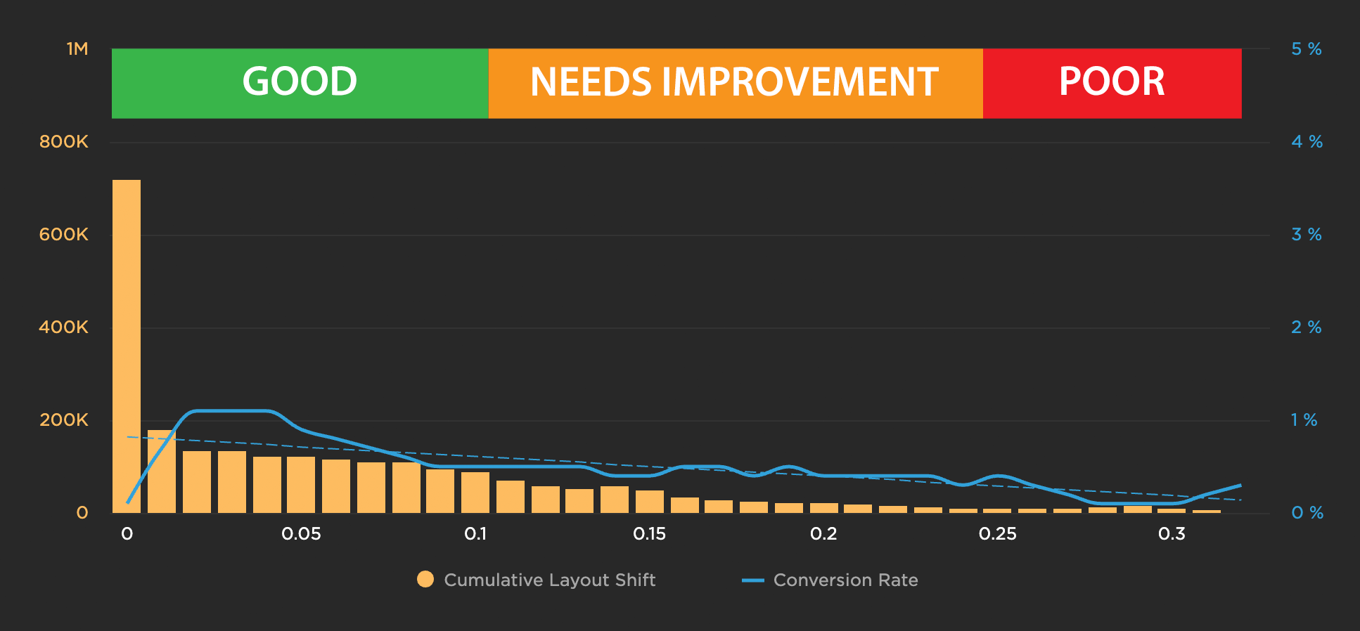
- Validate new metrics. For example, the chart below shows that, for this site, there's a correlation between Cumulative Layout Shift (one of Google's Core Web Vitals) and conversion rate.

Some correlation charts are available by default
Because SpeedCurve RUM collects bounce rate data, we're able to show you some charts out of the box. If you're already using RUM, you can see correlation charts that we give you by default in your Users, Design, and JavaScript dashboards.
Create custom bounce rate charts in your Favorites
To create a correlation chart in your Favorites dashboards:
- Go to a Favorite dashboard (or create a new one) and click the 'Add Chart' button.
- Select 'Correlation as the chart type.
- Define your data sources – first by selecting a performance metric (which generates the histogram) and then by selecting the correlation metric (which generates the line on the chart). In the example below, we've created a correlation chart that maps bounce rate to Largest Contentful Paint.
- Click 'Save' to save this chart in your Favorites.
Add your own business/engagement metrics to SpeedCurve
You can use SpeedCurve RUM to create correlation charts for data – such as cart size, conversion rate, and A/B test data – that you're capturing in other tools.

Updated 10 months ago