Custom dashboards & charts
With your Favorite dashboards, it's easy (yes, easy) for you to focus on the metrics that matter most to you and share them with your team.
At SpeedCurve, we're always working on helping you focus on the metrics that matter most to you. Your Favorites dashboards make it easy to focus on the metrics and data that are most meaningful to your business, and then share that data with your team.
Custom dashboards and charts let you do things like:
- Group charts into different dashboards for different users. For example: You can add an "Exec Summary" dashboard that includes high-level charts for those monthly management meetings. Or you can create separate project-related dashboards to help your dev team focus on priorities.
- Create performance budgets and set alerts.
- Combine synthetic data and RUM (real user monitoring) data in one chart.
- Choose average, median, or 95th percentile.
- Create charts that have multiple metrics.
- Select multiple values for a filter, eg, browser = Chrome or Firefox, country = UK or US.
- Compare A/B tests in a single chart.
How to create Favorites dashboards and charts
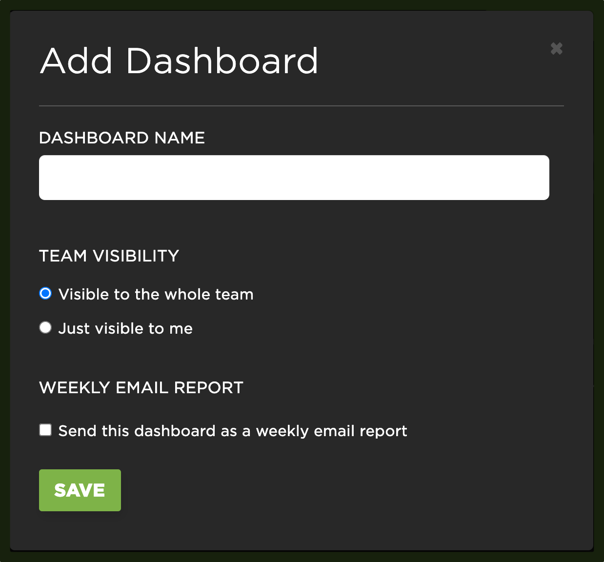
1. Add a new Favorites dashboard
In the Favorites menu you can choose an existing dashboard or add a new one:

You can choose to make your new dashboard visible to your entire team, or just to you. (You can change visibility at any point later.) You can also choose to have your dashboard automatically sent as a weekly email report.
2. Add a chart
Once on a dashboard, click the green 'Add Chart' button in the top right corner of the dashboard

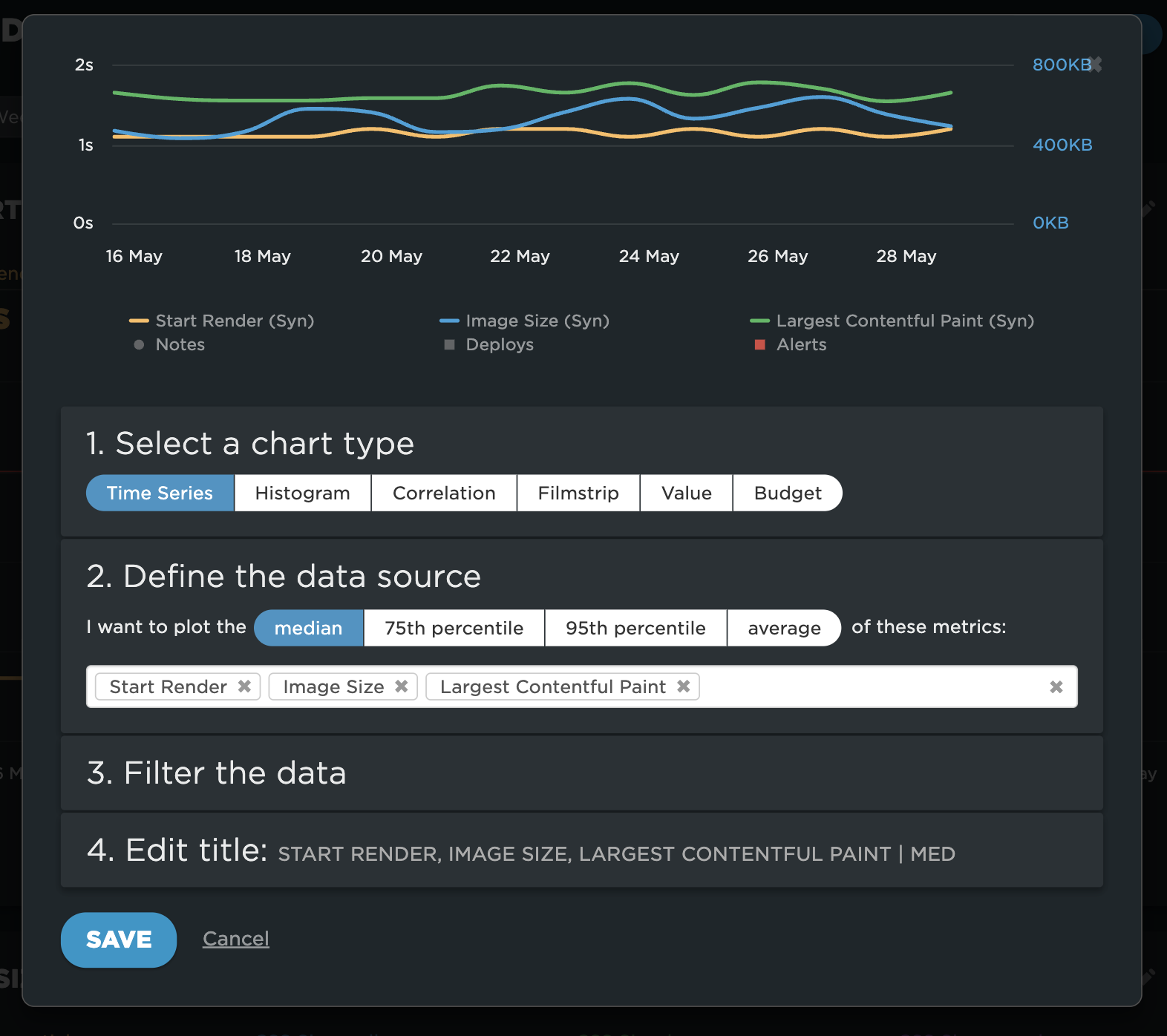
You can see all your custom chart options in the chart editor:
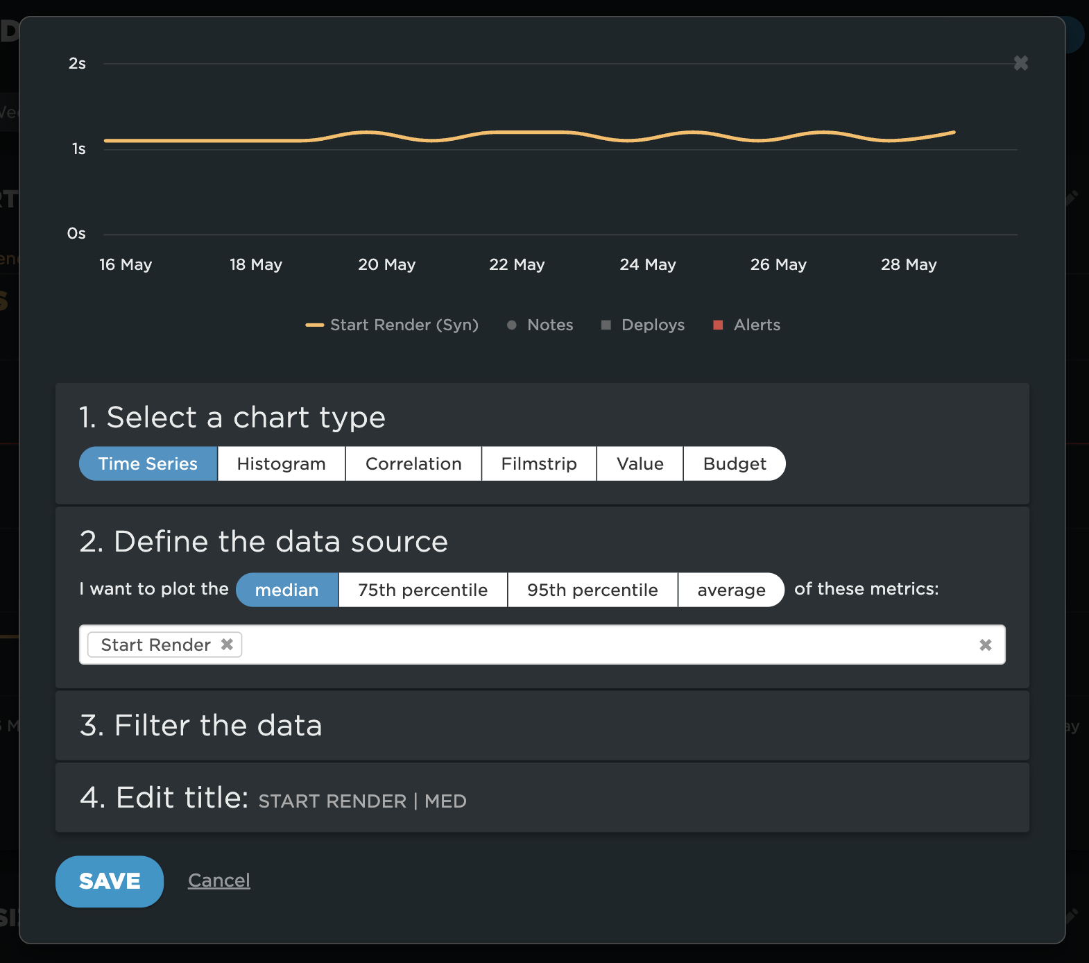
You have a ton of options, including the dozens of metrics you can measure with SpeedCurve synthetic monitoring and RUM.
You're not limited to looking at single metrics, either. You can look at several metrics side by side within the same chart. A preview of the chart is displayed at the top of the chart editor.
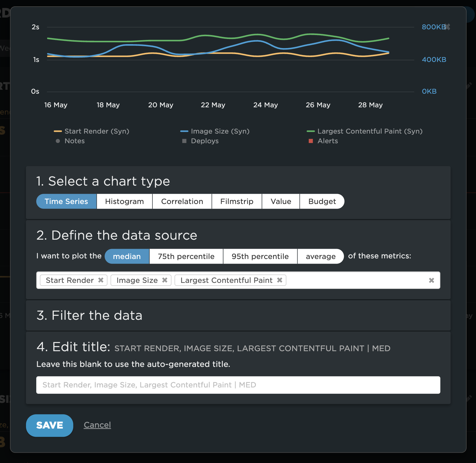
3. Be sure to give your chart a title – and don't forget to save it
Or you can keep the auto-generated title if you prefer.
4. Filter your data
After you've created and saved your custom chart(s), you'll see a menu at the top of the page that looks something like this:

Click the arrow to expand it, and you'll see your options for filtering your dashboard and selecting different time frames:

The custom dates option lets you do exactly that:

Here's an example of how this looks:

You can see a time series chart of the three metrics I'm comparing for the Home page (Start Render, Image Size, and Largest Contentful Paint), with the custom dates August 21-September 21. The average number for each metric is highlighted above the chart.
5. Share your Favorite dashboards
You've created a great set of custom charts, and now you want to show them to others, including people who aren't SpeedCurve users. Here's how to do that.
To edit a dashboard, click on the cog at the top right of the dashboard. You have the option to make it visible to the whole team or just yourself.

You can share the dashboard with anyone by clicking on the share icon at the top right of the dashboard and then copying the private link URL.

Updated 5 months ago