Summary Metric in Charts
What does the summary metric displayed in charts represent, and how can I change it?
What is Summary Metric
Summary metrics shown at the top of some favorite charts, such as timeseries charts, and represent each data series as a single value.
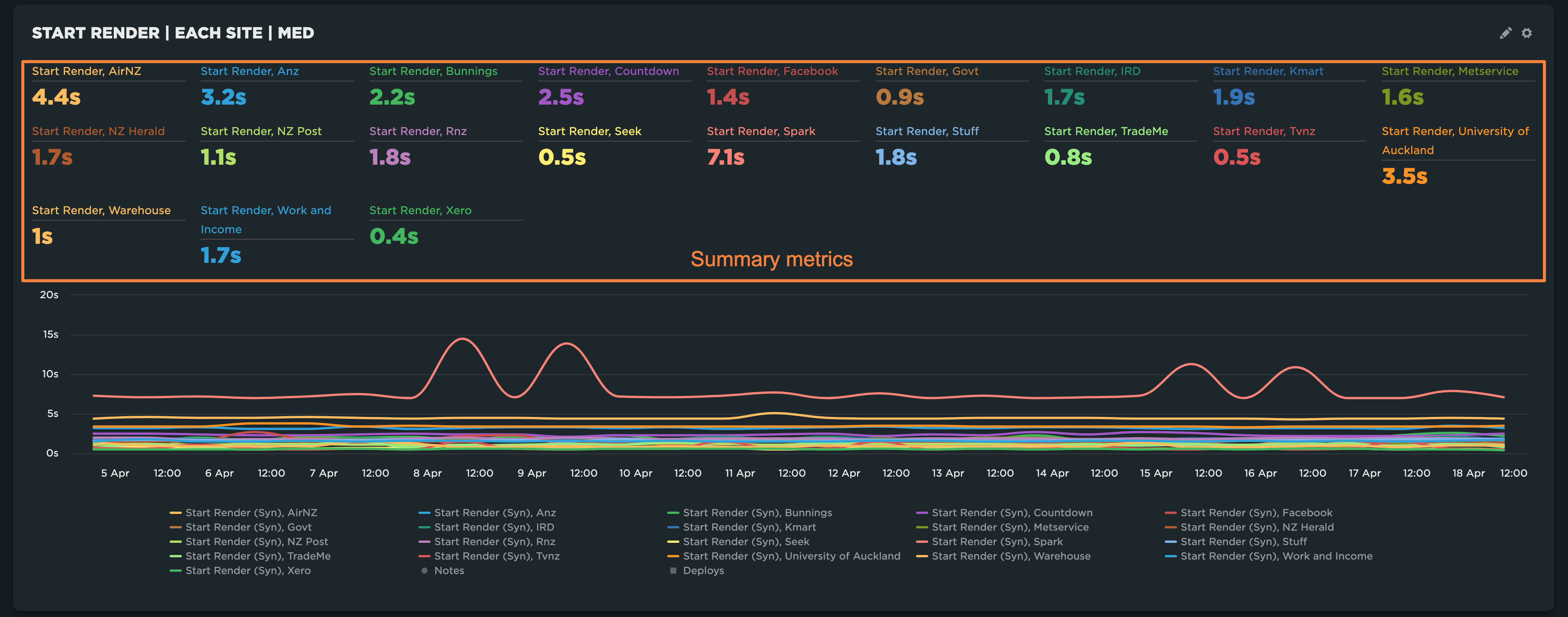
Summary metric value defaults to the latest value for each data series.
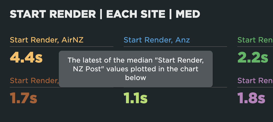
Hovering over a metric value will give you a tooltip with more context about the summary metric:
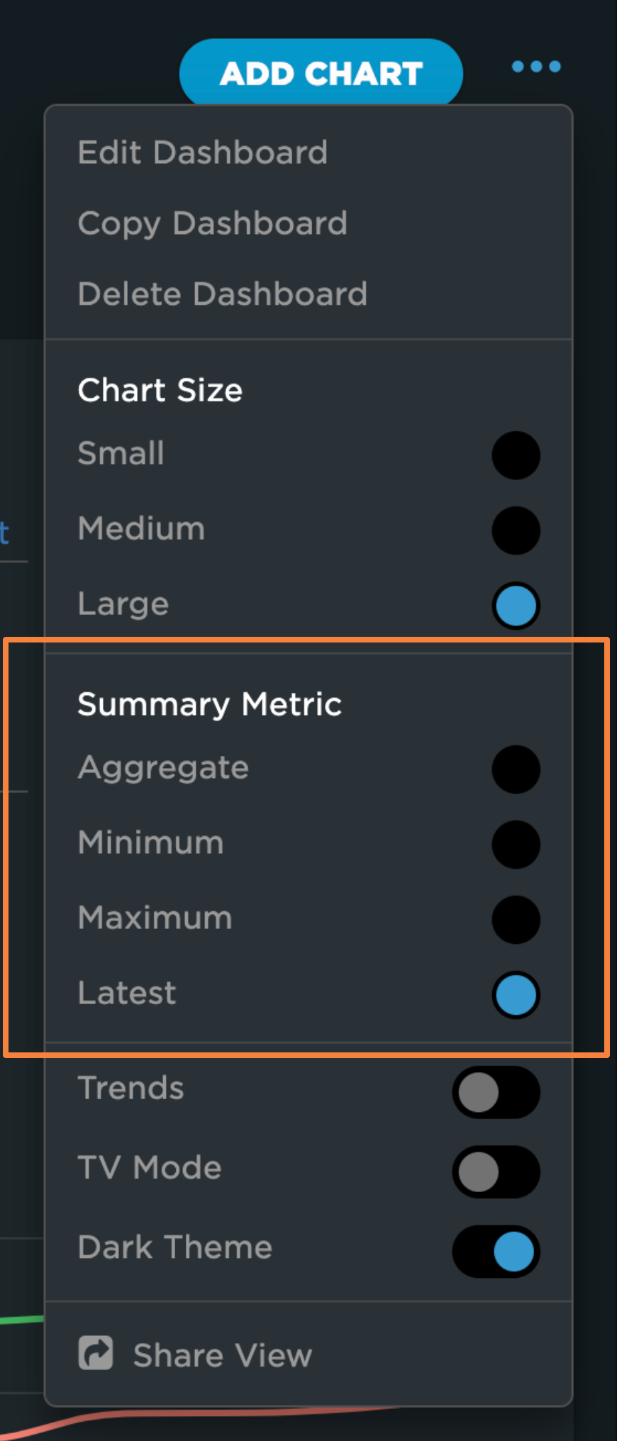
Changing Summary Metric
You can change it in the three dot dashboard menu (top right corner) and choose between Aggregate, Minimum, Maximum or Latest:
How the Aggregate Is Calculated
The "Aggregate" type means that the summary metric is calculated by aggregating all data points in the chart. If the chart uses average as the aggregation type, the summary metric will also be an average. For any other aggregation type—such as median, 75th percentile, or 95th percentile—the summary metric will be calculated as a median.
For example, if you select 75th percentile as the aggregation type in your chart settings, each data point in the chart represents the 75th percentile of all tests (for Synthetic) or all page views (for RUM) in the series at that point in time ("bucket"). The summary metric then shows the median of those 75th percentile values across the selected time range.
Summary Metric vs Value Chart
Note: value charts don't have summary metrics and always show the aggregated value using the aggregation type selected in the chart settings across all values in the selected time range.
Updated 15 days ago